

When i see these cute staff i really want laugh at them, the colours are funny
I will buy it and give them to my little bro or sis. And at the bottle design, the design is really easy, but when they put together they looks so good.

Painting Guernica was painted by Picasso in 1937; Guernica is a masterpiece of historic. 1937, World Expo held in Paris, Spanish government commissioned Picasso painting a picture for the Spanish Pavilion.
Guernica shows 1937 German Air Force bombed the Spanish town Guernica of atrocities crazy. As an artist with a strong sense of justice, Picasso was very indignant about the Nazi's barbarity, he took only a few weeks to finish the painting, as condemnation and protest against the brutal fascist.
The right side of this painting, a woman's embrace of the dead baby going to Heaven and cried, beneath the women, there is a fallen soldier who was holding a broken sword and flowers. The left side of this painting, a panic-stricken man screaming his back and raise your hands, not far from the soldier, a woman desperate to escape. All these in the painting are true portrayal of the victims of the bombing.
Many elements of the painting reflect Picasso factors for the absorption of traditional painting. The women embrace dead baby is like Christianity of the Virgin Mary; the fallen soldier may from painting of Italian Renaissance. It can be seen, Picasso is not just a rebellious rich bold innovator, is also a respected artist and master of traditional.
The whole painting was painted of black, white, grey, thus strongly underscores the tension and an atmosphere of terror of the painting.
Sources:


The first sight we can see there is a landscape with lots of trees and green grass. The colour is so amazing; it is really comfortable for eyes.
Then I noticed the shape, it looks like lung inside our body. The white roads like our blood vessels. On the right side lung, there is no grass in half of them, this part attract our views. From that I can feel the meaning of this advertisement very clean.
They use the nature environment to show the healthy lung, but when we start smoke, the nature environment has been destroyed. This really warned us do not smoke. I think everybody who sees it will quit smoke soon, and I love the idea of this.

I have seen a new logo design of Pepsi company when I search on web.
This is what i thinks whenever I see one of the new Pepsi ads. Wow that’s very funny.
I think
Look at the person’s foot, so cute, it looks like he can’t stand in his weight, and will fall off soon. It is a joke of Pepsi logo.
Red and blue, when they met, they create a really good look; i like the look, like these two colours, sometimes just using two colours can make things looks smart.


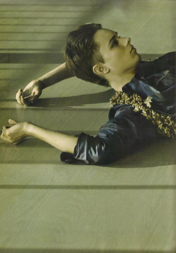


AnOther Magazine's launch in 2001 heralded
a new chapter in magazine publishing. Its blend of high fashion and world-class photography with features on the arts, politics and literature continues to make each beautifully crafted edition a collectors’ item. And my favourite fashion designer Alister Mackie is a stylist working as fashion editor in London.
In my opinion, readers of this magazine are always expecting to see challenging images and challenging design. Strive for directional design and fashion to give the reader more to think about than simply that to wear.
Visualize men and clothes in a way that is both diverse and unexpected. Try to relate the fashion to a wider movement or feeling in magazine. This magazine is subject to give another context to why men wear clothes.
Sources:
www.anothermag.com
http://alastairmackie.com
Emotional Magazine of Japan
